Descriptive statistics
Descriptive statistics is a branch of statistics that deals with collecting, analyzing, interpreting, and presenting data in an organized and effective manner. Its main objective is to provide simple and understandable summaries about the main characteristics of a dataset, without making inferences or predictions about a broader population.
A Guide to Descriptive Statistics in Python
Measures of Central Tendency
Measures of central tendency are numerical values that describe how data in a set are centralized or clustered. They are essential in statistics and data analysis because they provide a summary of information, allowing us to quickly understand the general characteristics of a data distribution.
To illustrate these concepts, we will use a Pandas DataFrame.
import pandas as pd
import numpy as np

# We create an example DataFrame
data = {'values': [10, 20, -15, 0, 50, 10, 5, 100]}
df = pd.DataFrame(data)

print(df)
Mean
It is the average of a set of numerical data.
```py runable=true mean = df['values'].mean() print(f"Mean: {mean}")
**Median**

It is the middle value when the data are ordered.

```py runable=true
median = df['values'].median()
print(f"Median: {median}")
Mode
Value that occurs most frequently.
```py runable=true mode = df['values'].mode() print(f"Mode: {mode}")
These measures are fundamental for describing and analyzing data distributions.

#### Measures of dispersion

**Measures of dispersion** are numerical values that describe how varied the data are in a set. While measures of central tendency tell us where the data are "centered", measures of dispersion show us how much those data "spread out" or "vary" around that center.

**Range**

The difference between the maximum value and the minimum value of a data set.

```py runable=true
range_ = df['values'].max() - df['values'].min()
print(f"Range: {range_}")
Variance and standard deviation
Both metrics measure how far, on average, the values are from the mean. Standard deviation is more interpretable because it is in the same units as the original data. Pandas calculates both easily.
```py runable=true variance = df['values'].var() std = df['values'].std() print(f"Variance: {variance}") print(f"Standard Deviation: {std}")
#### Shape measures
The **shape measures** describe how the values in a data set are distributed in relation to the measures of central tendency. Specifically, they tell us the nature of the distribution, whether it is symmetric, skewed, or has heavy tails, among others.
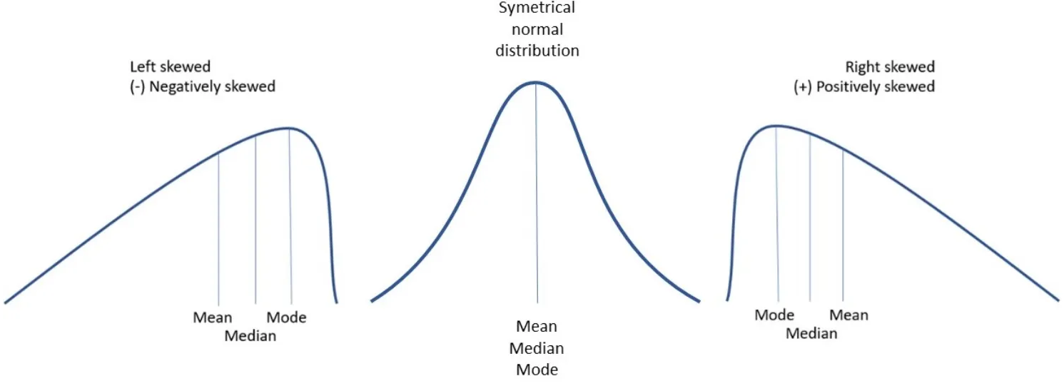
**Skewness**
Measures the lack of symmetry in the data distribution. A positive skewness indicates that most of the data are on the left and there are a few very high values on the right. A negative skewness indicates that there are more unusually low values. If it is close to zero, it suggests that the data are quite symmetrical.
```py
skewness = df['values'].skew()
print(f"Skewness: {skewness}")
Kurtosis
Kurtosis measures the "heaviness of the tails" and the "peakedness" of a distribution. In practical terms, it tells us the probability of finding atypical values (outliers). Its usefulness is key, for example, in financial risk modeling, where a high kurtosis means a higher risk of extreme events. A positive kurtosis indicates a sharper peak compared to the normal distribution. A negative kurtosis indicates a flatter peak and lighter tails. A kurtosis close to zero is ideal, as it suggests a shape similar to that of the normal distribution.

The df.kurt() method in Pandas calculates the excess kurtosis, which facilitates comparison with the normal distribution.
Here we show you the three main types of kurtosis:
- Leptokurtic: Distribution with a sharper peak and heavier tails than the normal. It has more outliers. An example is the Student's t-distribution. Its excess kurtosis is positive (> 0), which in financial modeling translates to higher risk.
- Mesokurtic : Distribution with a shape similar to the normal distribution. Its excess kurtosis is close to zero (= 0).
- Platykurtic : Distribution with a flatter peak and lighter tails than the normal. It has fewer outliers. An example is the uniform distribution. Its excess kurtosis is negative (< 0), which indicates a lower risk of extreme events.
```py runable=true kurt = df['values'].kurt() print(f"Kurtosis: {kurt}")
#### Data visualization

Visualizing data is fundamental. Histograms, bar charts, and scatter plots are often used, depending on the data type.
```py runable=true
import matplotlib.pyplot as plt

# We create a histogram to visualize the distribution of the data
df['values'].hist(bins=5)
plt.title('Histogram of the Value Distribution')
plt.xlabel('Values')
plt.ylabel('Frequency')
plt.show()